Map Designer
- Robert Hunt (Unlicensed)
- Jon Mole (Deactivated)
- Former user (Deleted)
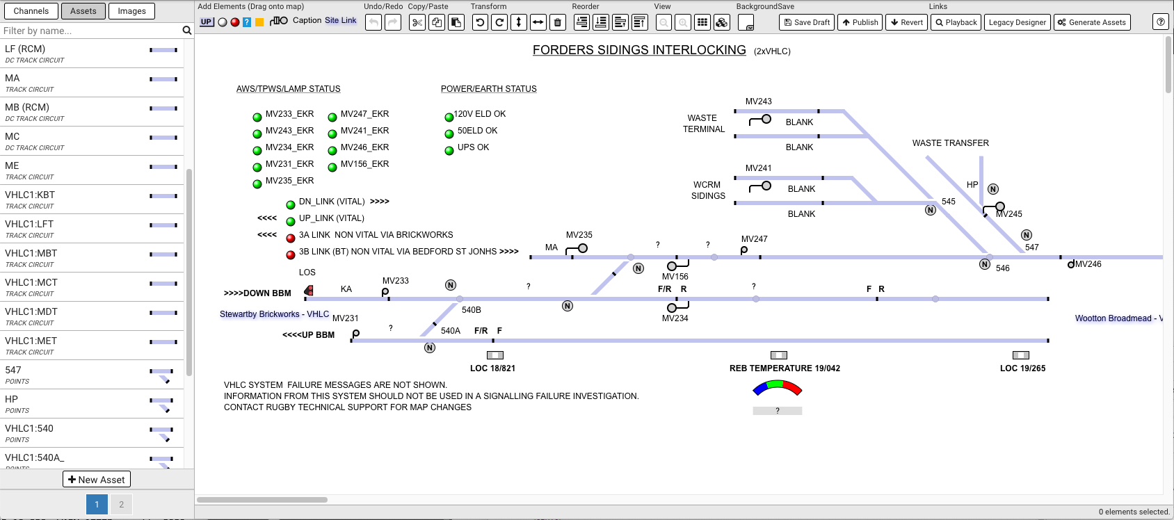
Table of Contents
Left Sidebar
The left sidebar in the new designer is similar to the legacy designer and contain three tabs containing a list of channels, asset and custom images for the site.
Each tab has a search field at the top of the list that allows you to narrow down the contents.
If the item you are looking for is not visible in the list it may appear on subsequent pages. At the bottom of the list is a paging toolbar that allows access to other pages.
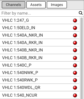
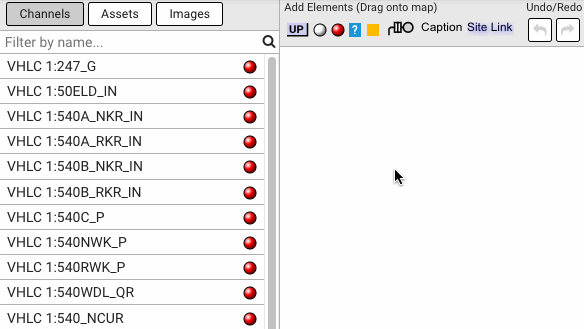
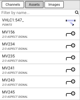
Channels
This tab list all of the digital and analogue channels available on the site, archived channels are not shown.
You can click and drag the channel icon from the list onto the map. For digital channels an coloured indication will be created, for analogue channels a text based indication will be created that shows the current value of the channel. The indications can be edited once on the map.
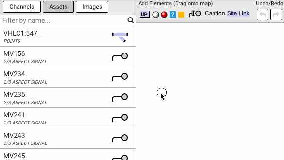
Assets
This tab list assets on the site which have a graphical representation for the map, some of the newer assets do not currently have a graphical representation and will not be present in the list.
You can click and drag the asset icon from the list onto the map.
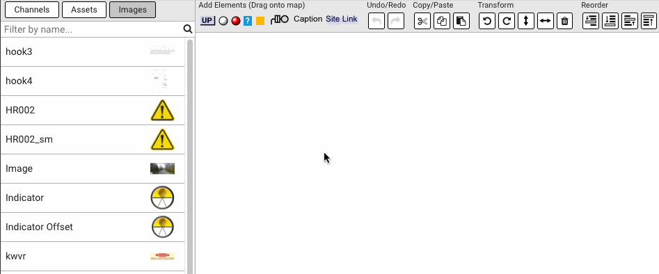
Images
This tab list custom images that have been uploaded which can be included on the map.
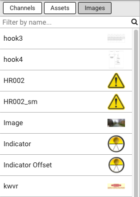
You can click and drag the image icon from the list onto the map. A dialog will be shown where you can specify a caption if required. Once the image is on the map it can be resized by dragging from any of the four corners.
Right Sidebar
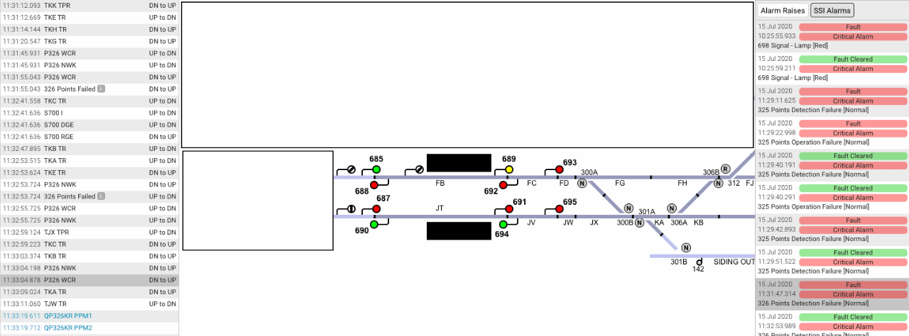
The right sidebar in the Playback contains two tabs with corresponding alarm raises lists 'Alarm Raises' and 'SSI Alarms'. 'Alarm Raises' , 'SSI Alarms' and 'info' list on Playback's left side are interconnected. Therefore, scrolling time selector list updates 'Alarm Raises' and 'SSI Alarms' lists.
Toolbar
Icon | Description |
|---|---|
| Drag onto the map to create a new DN/UP indication. |
| Drag onto the map to create a new grey/white indication. |
| Drag onto the map to create a new grey/red indication. |
| Drag onto the map to create a new analog indication. |
| Drag onto the map to create a new text indication. |
| Drag onto the map to create a new platform/building. |
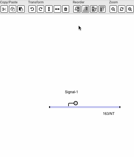
| Drag onto the map to create a new auto signal. |
| Drag onto the map to create a new caption. |
| Drag onto the map to create a new site link. |
| Undo the last operation (CTRL Z). |
| Redo the last undone operation (CTRL Y). |
| Remove the selected elements and copy them to the clipboard (CTRL X). |
| Copy the selected elements to the clipboard (CTRL C). |
| Insert the elements currently on the clipboard (CTRL V). |
| Rotate the selected elements anticlockwise (L). |
| Rotate the selected elements clockwise (R). |
| Flip the selected elements vertically (Y). |
 | Flip the selected elements horizontally (X). |
| Remove the selected elements (DELETE). |
 | Move the selected elements backwards. See move element backwards. |
 | Move the selected elements to the back (CTRL B). See move element to the back. |
 | Move the selected elements forwards. See move element forwards. |
 | Move the selected elements to the front (CTRL F). See move element to the front. |
| Zoom out (-). |
| Reset Zoom |
| Zoom in (+). |
| Toggle the grid (G). |
| Toggle the map element hit-boxes. |
| Update the map background colour. |
| Save the current map and publish it as the current live map. |
| Save the current map as a draft. |
| Undo any changes saved since the map was last published. |
| View the current map in playback (opens in a new tab). |
| Run the asset generator on the site, this will attempt to generate assets based on the channel names. See Generate Assets. |
| Show Help
|


Using the Editor
This section describes how the use the core functionality of the map designer.
Supported Operations
The table below shows which operations are supported for each different object type.
| Object Type | Resize | Rotation | Horizontal Flip | Vertical Flip |
|---|---|---|---|---|
| Track Circuit |  | 45° |  | |
| Points | | 45° | | |
| 2/3 Aspect Signal | | 45° | | |
| 4 Aspect Signal | | 45° | | |
| Banner Signal | | 45° | | |
| Driver's White Light | | 45° | | |
| Position Light Signal | | 45° | | |
| Treadle | | 90° | | |
| Level Crossing Barrier | | | | |
| Level Crossing Road Lights | | | | |
| Digital Indications | | | | |
| Analogue Indications | | | | |
| Text Indications | | | | |
| Platform/Building | | 90° | | |
| Auto Signal | | 45° | | |
| Caption | | | | |
| Site Link | | | | |
| Custom Image | | 90° | | |
Moving Objects
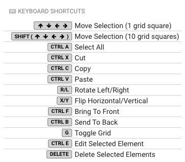
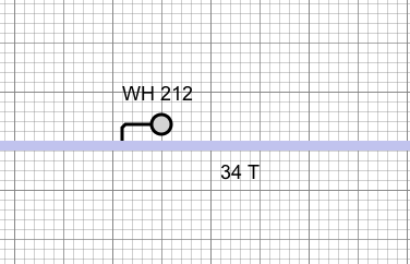
When moving objects, they will snap to the underlying grid, use the toolbar button or press the G key to show the grid:
To move objects on the map, you can simply click and drag them, they will follow the cursor but still snap to the grid.
You can also use the arrow keys on the keyboard to move objects. Select the object with the mouse and then press the arrow keys to move the object. Each keypress will move the object by 1 grid square.
You can also move objects in bigger increments by holding the Shift key while pressing the arrow keys. Each keypress will move the object by 10 grid squares.
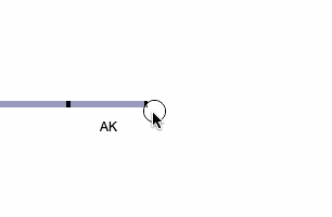
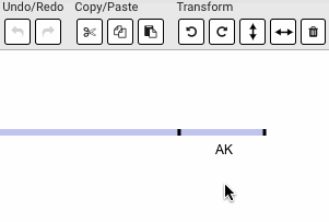
Resizing Objects
Object that support resizing can be resized by dragging the corners or ends of the object as shown below. Objects have a minimum size which prevents them from being made too small.
Rotating Objects
You can rotate object by first selecting them and then using the "rotate clockwise" or "rotate anticlockwise" buttons. Alternatively you can use the keyboard shortcuts R and L.
Flipping Objects
You can flip object vertically or horizontally by first selecting them and then using the "flip vertically" or "flip horizontally" buttons. Alternatively you can use the keyboard shortcuts X and Y.
Deleting Objects
You can delete object by selecting them and using the "Remove" button. You can also use the DELETE key.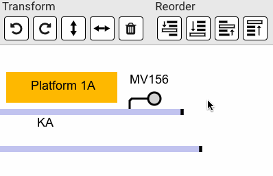
Saving Changes
Once you have made changes to a map you can save them using the  button. This will save the changes in the designer but they will not yet be visible in playback. This allows you to make changes to the map without affecting the currently live map used by playback. Once you are happy with your changes and want to update the live map, press the
  button. The table below shows how this system works:
| Version | Type | ||
|---|---|---|---|
| V1 | DRAFT | |
| V2 | DRAFT | ||
| V3 | PUBLISHED | ← Version live in Playback | |
| V4 | DRAFT | ||
| V5 | DRAFT | ← Version live in Designer | |
If you have made changes to the map but are not happy and want to revert to the last published version (the one in use on playback) you can use the  button to restore the designer to that version. This is shown in the table below:
| Version | Type | |||
|---|---|---|---|---|
| V1 | DRAFT | ||
| V2 | DRAFT | |||
| V3 | PUBLISHED | ← Version live in Playback & Designer |
| |
Undo / Redo
The undo (reverse changes) and redo (restore changes) functionality has been added together with History tab which records the current undo/redo states. Everything on the map should be reversible/restorable, other than editing assets.
Zoom in / Zoom Out / Reset Zoom
You can zoom in / zoom out / reset zoom by using "Zoom in" / "Zoom out" / "Reset zoom" buttons. Alternatively you can use the keyboard shortcuts + / - / 0.
By the end of 2020 all mainstream browsers will drop support for Adobe Flash player. Historically Centrix relied on Flash Player for the components written using Apache Flex to run, this included the graphical replay component (playback) and the map designer. There are now replacements for these components written in modern web technologies. This page explains the compatibility between various components.
Sites with maps created in the Legacy Designer
Sites which have a map that was originally created using the legacy Flash Player based designer will be automatically migrated into the new format once the designer is opened. You can go ahead and make changes to the map and when you save the changes the map will be saved in the new format.
Compatibility Warning
Once you save a map in the new designer for a site you will no longer be able to access either the legacy playback or legacy designer for the site due to incompatible map formats. You must use the new playback and designer going forward for the site.
Access to the Legacy Designer
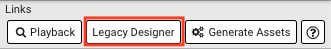
Access to the legacy Flash Player based designer is only available on sites which have not yet be edited in the new designer via the "Legacy Designer" button on the toolbar. Once a draft has been saved or committed for a site then access to the legacy designer is no longer possible due to incompatible map formats.
Access to Legacy Playback
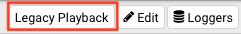
Access to the legacy Flash Player based playback page is only available on sites which have not yet be edited in the new designer via the "Legacy Playback" button on the toolbar. If this button is not present on a site then the map has been edited in the new designer.
Compatibility Matrix
| New Playback | New Designer | Legacy Playback | Legacy Designer | |
|---|---|---|---|---|
| Edited in Legacy Designer | | | | |
| Edited in New Designer | | | | |
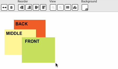
Changing element layering
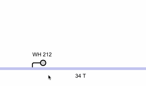
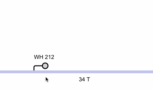
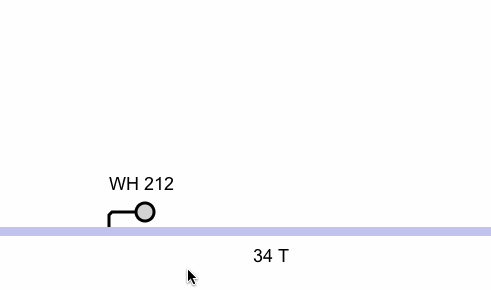
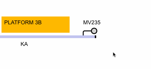
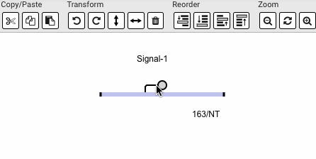
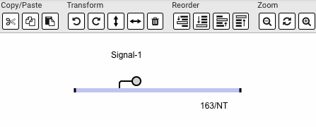
All elements on the map have their own "layer" which allows them to be positioned in front or behind other elements on the map. This can be useful in situations where you have something like a text caption from one object that you want to appear on top of another.
The example below shows a platform object obscuring the caption of a signal, this can be resolved in one of two ways:
- Select the signal and use one of the "move forwards" operations.
- Select the platform and use one of the "move backwards" operations.
Below are examples of each of the four different operations in action.
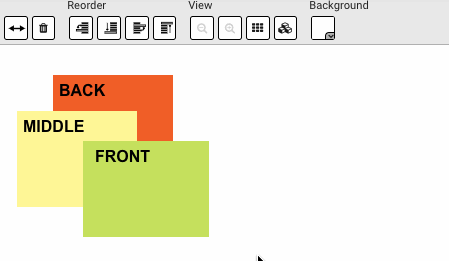
Move element backwards
Move element to the back

Move element forwards

Move element to the front
Objects
The "edit" dialogs should feel familiar if you have used the legacy Flash Player based designer, we have tried to keep them as similar as possible.
You can edit object by double-clicking them on the map or by using the keyboard shortcut ( ) when they are selected.
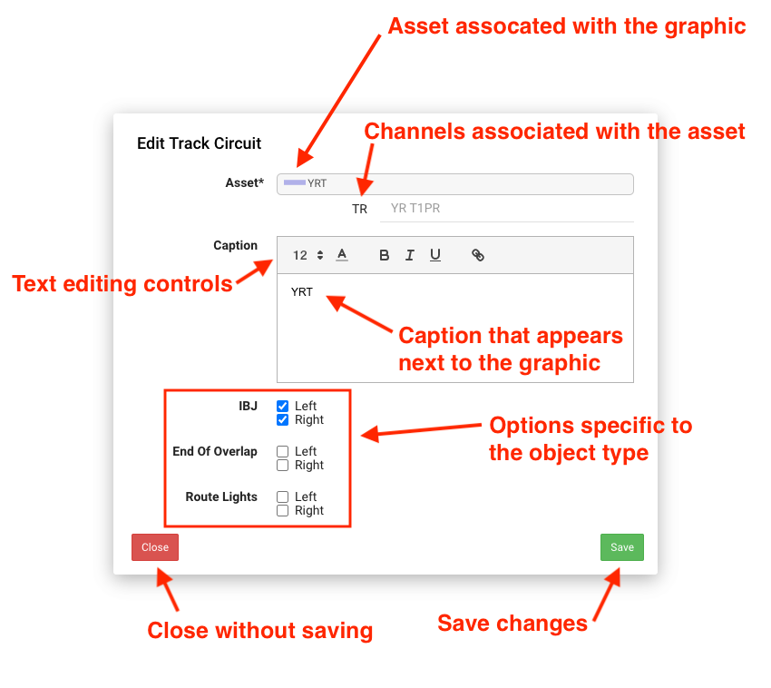
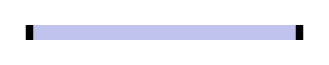
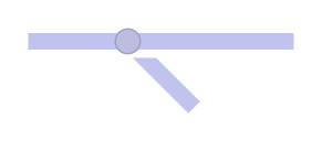
Track Circuit

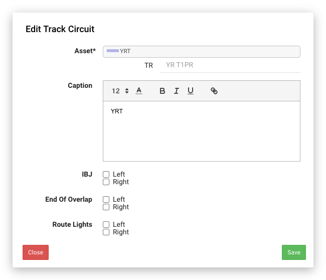
The table below shows how the track circuit graphic looks in various configurations, you can of course combine multiple options such as IBJs and route lights.
| IBJ | End of Overlap | Route Lights | Graphic |
|---|---|---|---|
|
| |
|
| | |
|
| | |
|
| | |
|


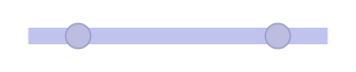
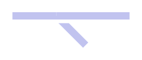
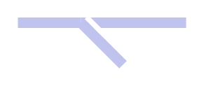
Points
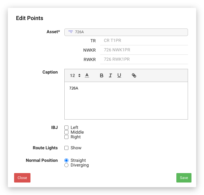
The table below shows how the points graphic looks in various configurations, you can of course combine multiple options such as IBJs and route lights.
| IBJ | Route Light | Normal Position | Graphic |
|---|---|---|---|
| | Straight |
|
| | Diverging |
|
| | Straight |
|
| | Straight |
|
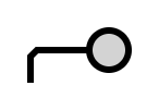
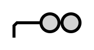
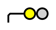
2/3 Aspect Signal
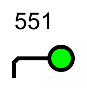
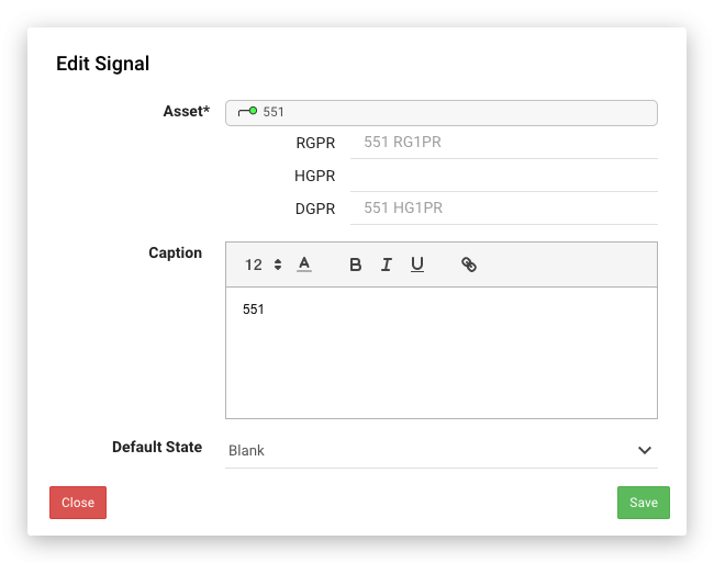
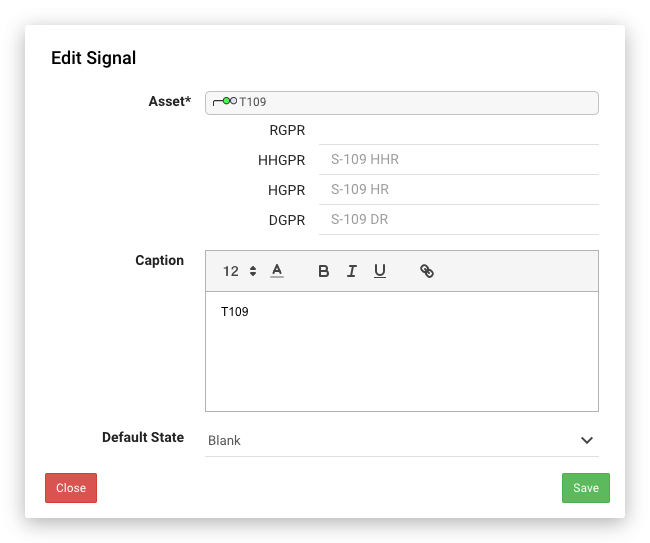
The table below shows how the signal graphic looks in various configurations. You can customise the default state in situations where the associated asset is not monitoring all of the signal functions and you would like the signal to show a specific state by default.
Default State | Graphic |
|---|---|
Blank |
|
| Yellow |
|
| Red |
|
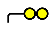
4 Aspect Signal
The table below shows how the signal graphic looks in various configurations. You can customise the default state in situations where the associated asset is not monitoring all of the signal functions and you would like the signal to show a specific state by default.
Default State | Graphic |
|---|---|
Blank |
|
| Yellow |
|
| Double Yellow |
|
| Red | 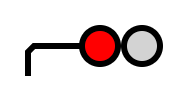 |
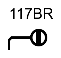
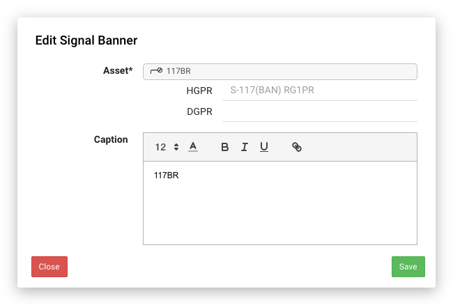
Banner Signal
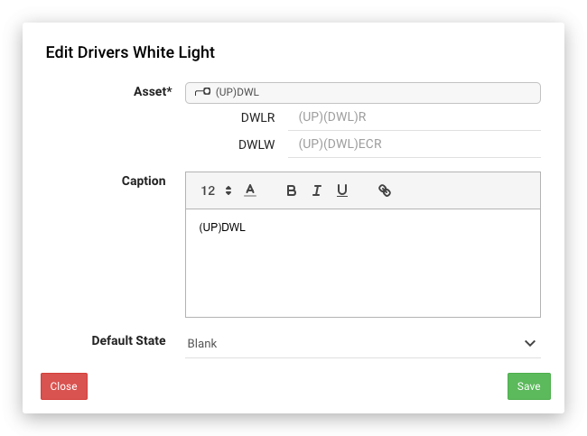
Driver's White Light
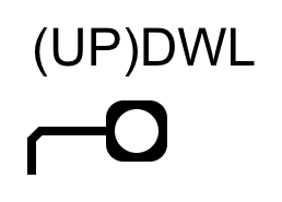
Default State | Graphic |
|---|---|
Blank |
|
| Red | 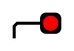 |
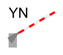
Level Crossing Barrier
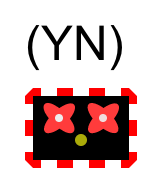
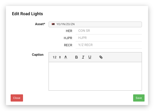
Level Crossing Road Lights
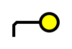
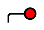
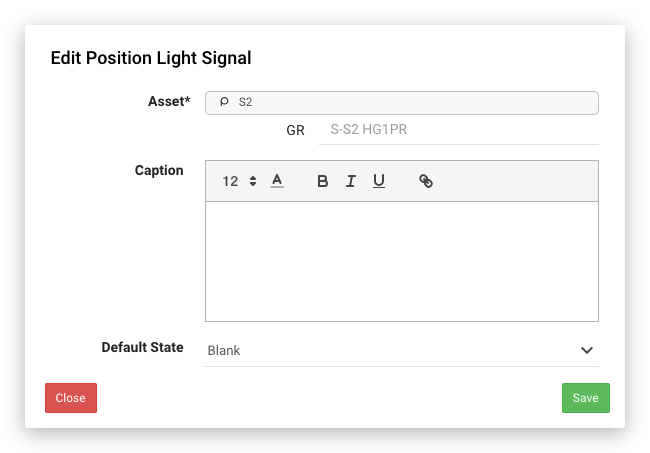
Position Light Signal
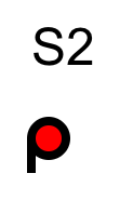
Default State | Graphic |
|---|---|
Blank |
|
| Red |
|

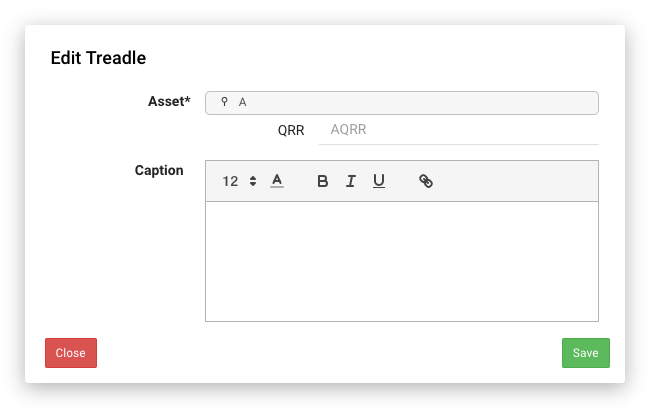
Treadle

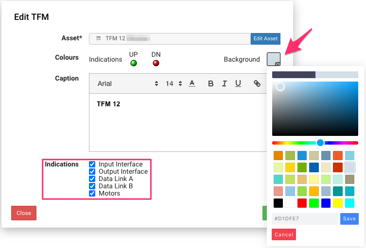
TFM (Trackside Functional Module)
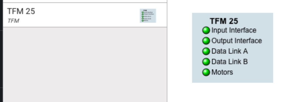
The background colour can be changed using the "Background" field, the text will appear as black or white depending on the background colour. TFM Asset specific options called "Indications" allow user to show/hide listed channels.
Digital Indication
Digital indications can be created by dragging from one of the three icons on the designer toolbar or by dragging directly from the channel list (see Map Designer#Channels). When dragging from the toolbar you will need to fill in the "Dip 1" and optionally the "Dip 2" field by selecting a channel from the list. When dragging from the channels list, the "Dip 1" field will be automatically populated.
By default, the caption field will be set to the name of the input. Changing the input will also change the caption field unless it has been customised.
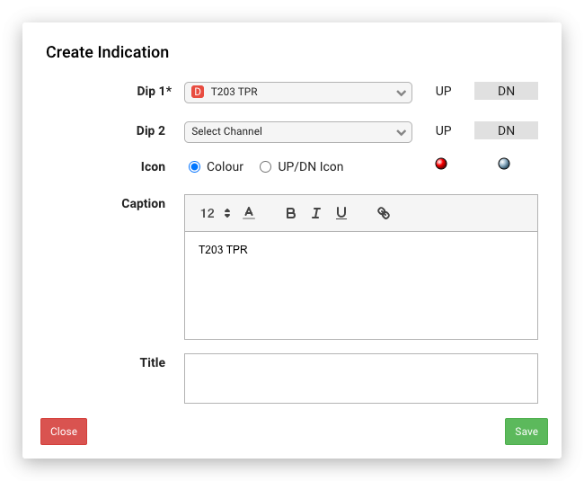
Icon Field
Clicking on the coloured circles will open up a colour picker to allow you to customise the indication colour for a particular state. You can either select from the predefined colour palette, use the sliders/gradient to find a specific colour or type in the hex value (HTML colours) for a specific colour.
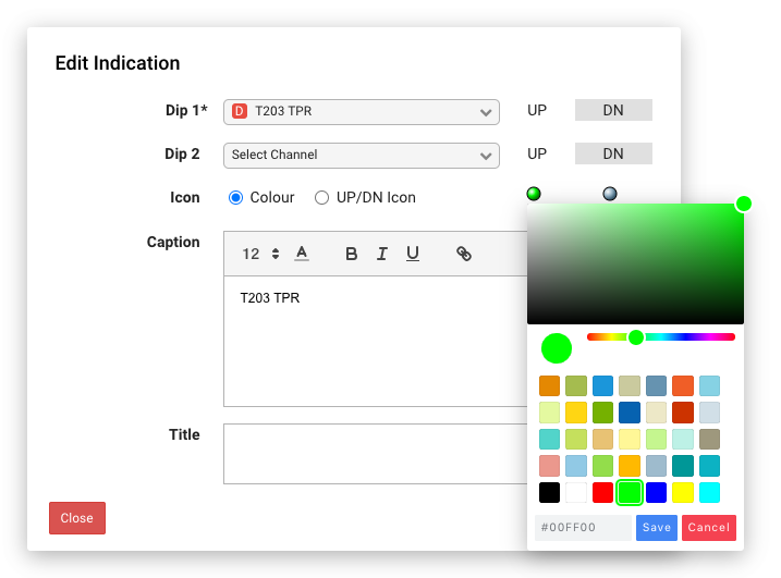
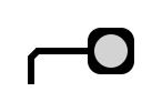
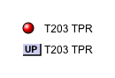
You can also select the "UP/DN Icon" option if you prefer rather than the coloured icons.
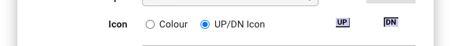
You can see the difference between the icons below:
Multiple Inputs (quad state indication)
If you specify a second input for an indication using the "Dip 2" field then there will be four options for the icons.
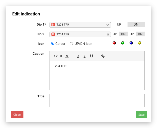
| Input 1 | Input 2 | Colour |
|---|---|---|
| UP | UP |
|
| UP | DN |
|
| DN | UP |
|
| DN | DN |
|


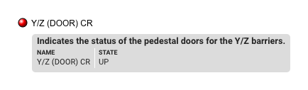
Title Field
The "title" field is unique to the indication dialogs, it allows you to specify text that will appear on the tooltip in playback and can be used to add extra detail about the indication.
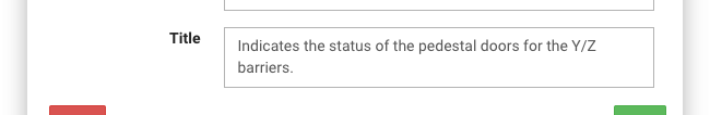
It will appear at the top of the tooltip when hovering over the indication in playback:
Analogue Indication
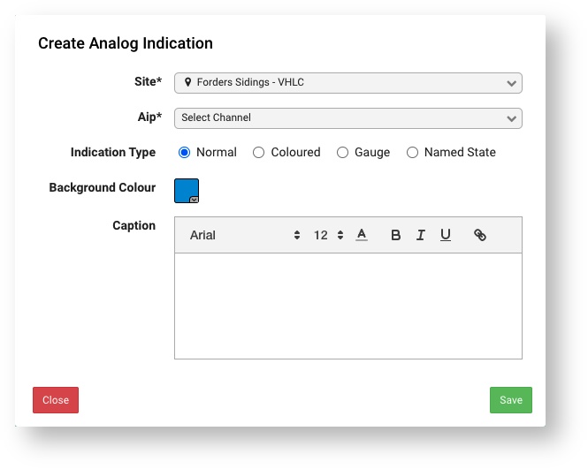
Analogue indications can be created by dragging from the icon on the designer toolbar or by dragging directly from the channel list (see Map Designer#Channels). When dragging from the toolbar you will need to select the "Aip" field by selecting a channel from the list, the "Site" field will be automatically populated with the Map Designer's site. You are able to select an Aip from any Site that you have access to, by first selecting that Site in the "Site" field. When dragging from the channels list, both the "Site" and Aip" fields will be automatically populated.
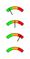
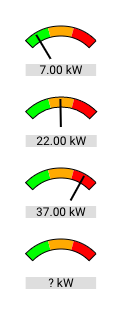
Analogue indications can be represented in various different ways. The table below shows how they looks in each of the configurations.
| Normal | Coloured | Gauge | Gauge with Label | Named State |
|---|---|---|---|---|
|
|
|
|
|
Normal
The "normal" representation simply shows the current value of the analogue channel as text along with unit (if present on the channel). The background colour can be changed using the "Background Colour" field, the text will appear as black or white depending on the background colour.
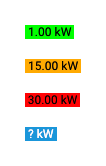
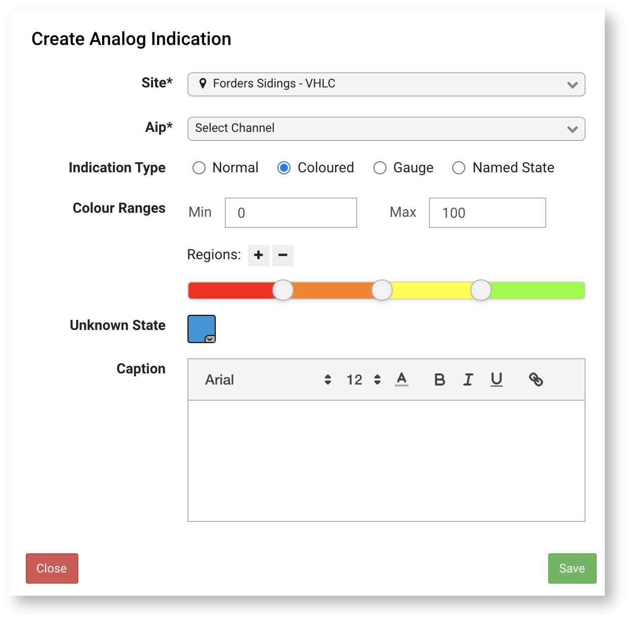
Coloured
The "coloured" representation is the same as the "normal" representation but with the addition of the background colour changing dynamically based on the current value. First set a "Min" and "Max" values to specify the range then add or remove regions using the "+/-" buttons to change how many colours you want, there is a minimum of two. Drag the slider to set the boundary between colours, a tooltip will appear showing the value as you drag the slider. To change the colour of a region simply click on the slider a colour picker dialog will appear, allowing you to set the colour.
Values below "Min" will have a background set as the first colour and values above "Max" will have a background set as the last colour.
The "Unknown State" colour will be used as the background colour when the value is unknown.
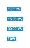
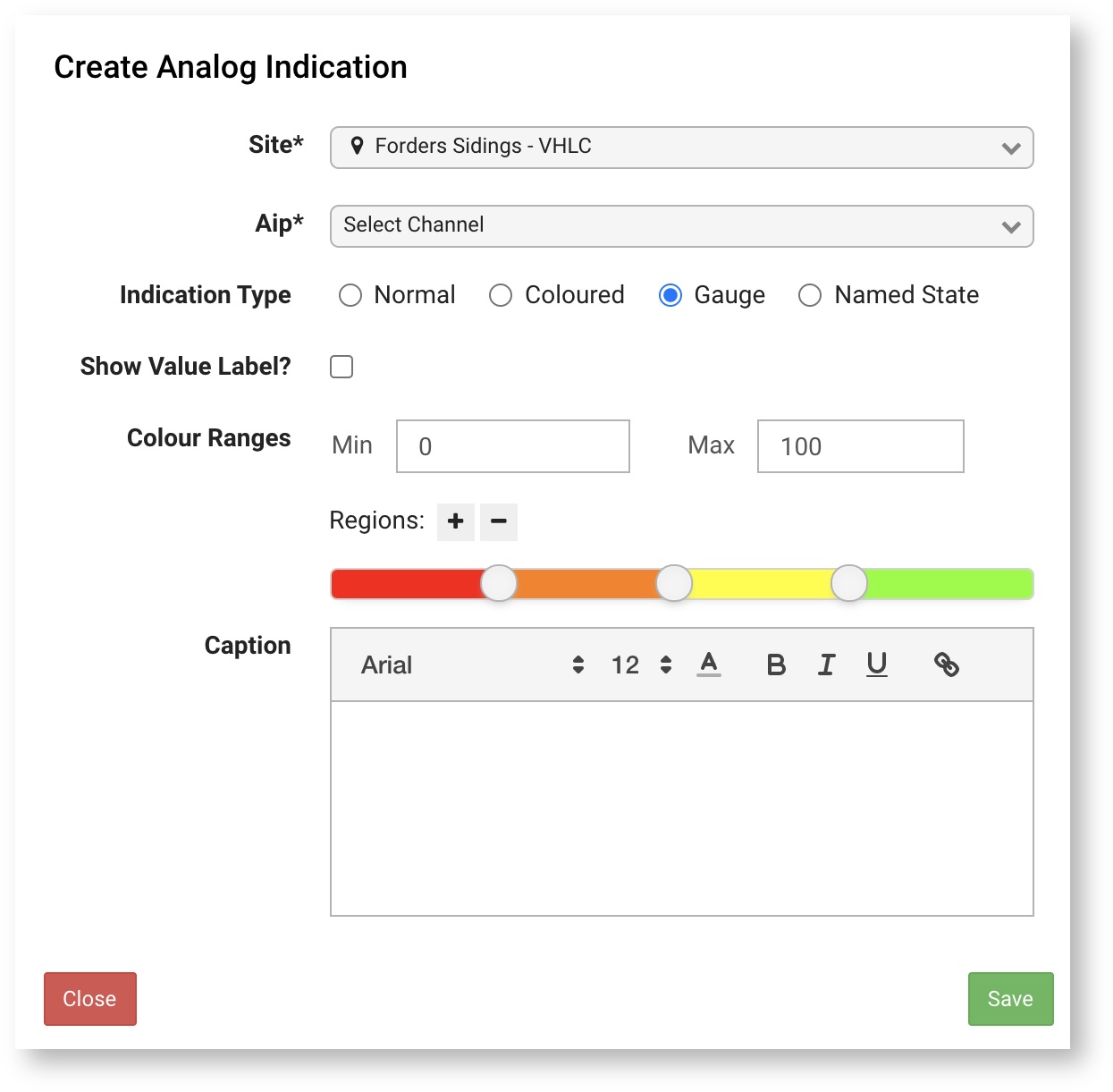
Gauge
The "gauge" representation is similar to the "coloured" representation in terms of configuration but is displayed as a gauge and needle indicating the current value. First set a "Min" and "Max" values to specify the range then add or remove regions using the "+/-" buttons to change how many regions you want on the gauge, there is a minimum of two. Drag the slider to set the boundary between regions, a tooltip will appear showing the value as you drag the slider. To change the colour of a region simply click on the slider a colour picker dialog will appear, allowing you to set the colour. Check the "show value label" if you want a the current value to also be displayed below the gauge.
Values below "Min" will show the needle at the start of the gauge in the first region and values above "Max" will show the needle at the end of the gauge in the last region.
Unknown value will not show the needle, if the "show value label" option is enabled then a question mark will be displayed.
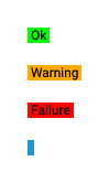
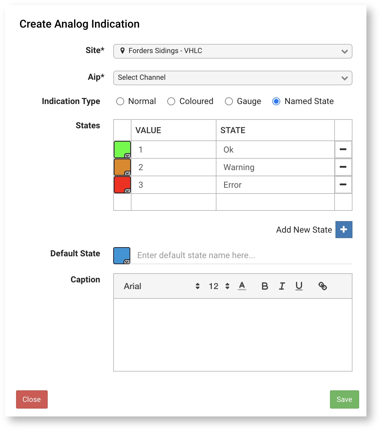
Named State
The "named state" representation is only useful in specific situations where you have an analogue channel with distinct values that represent states such as an error code. You can create one or more states with a value and state that will be displayed as text and also assign a background colour to them, similar to the "coloured" representation. The value on the analogue channel must be an exact match for the state to appear, for example a value of "1.1" will not match a state configured with the value of "1". Any values that do not match a state will be displayed as the "default state".
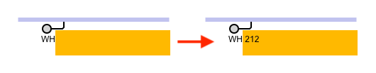
Text Indication
Text indications can be added to the map by dragging the icon on the designer toolbar or by dragging directly from the channel list. They will show the latest value of a text channel which is useful for information such as Train Describer (TD) berths. When dragging from the toolbar you will need to select the "Text Channel" field by selecting a channel from the list, the "Site" field will be automatically populated with the Map Designer's site. You are able to select a Text channel from any Site that you have access to by first selecting that Site in the "Site" field. When dragging from the channels list, both the "Site" and "Text Channel" fields will be automatically populated.
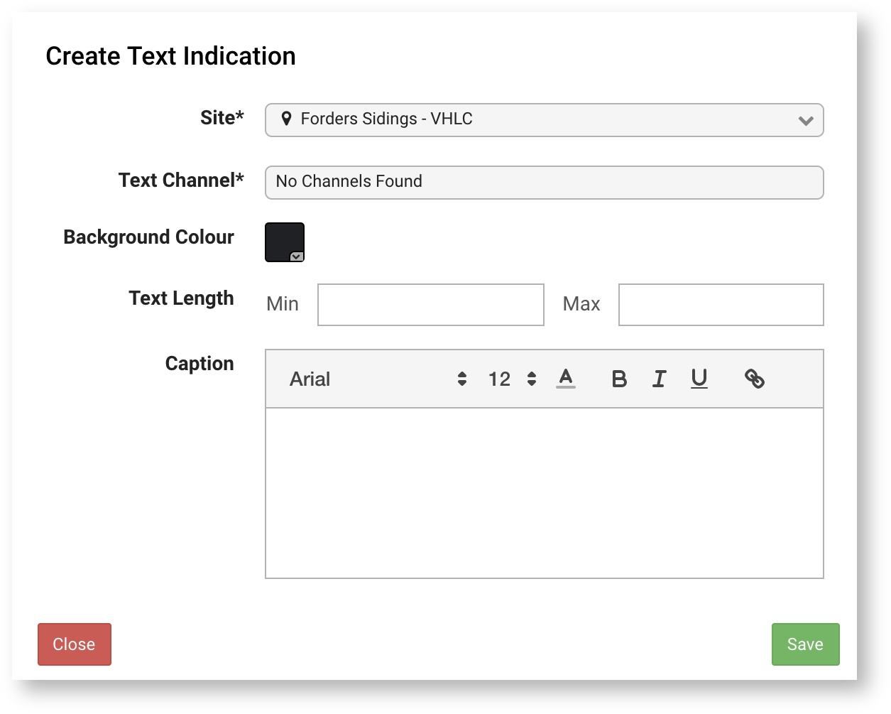
The table below explains how the "min" and "max" settings work.
| Data | Min | Max | Description | Graphic |
|---|---|---|---|---|
| | Field is 1 character wide when empty (no value). |  | |
| 5Q70 | | | Field is expands to fit the value. |  |
| 4 | | Field is 4 characters wide when empty (no value). |  | |
| 5Q70 | 4 | | Field starts at 4 characters wide, values shorter than 4 characters will be padded and the field will expand to fit longer values. | |
| 2 | Field is 1 character wide when empty (no value). | | |
| 5Q70 | | 2 | Field starts at 1 character wide and expands up to 2 characters to fit the value. Longer values will be truncated. |  |
| 2 | 3 | Field is 2 characters wide when empty (no value). |  | |
| 5Q70 | 2 | 3 | Field starts at 2 characters wide and expands up to 3 characters to fit the value. Longer values will be truncated. |  |
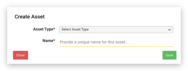
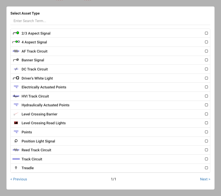
Creating Assets
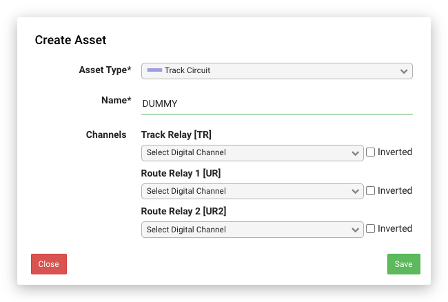
The map designer has limited functionality for creating assets, you are only able to create assets which have a graphical representation on the map such as track circuits, points, signals etc. Additionally, you can only populate the digital inputs on the asset from the designer. We recommend that you use the main menu item Assets > Asset List > Create New Asset for creating assets.
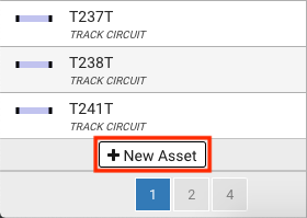
You will find the New Asset button at the bottom of the Asset tab.
Editing Assets
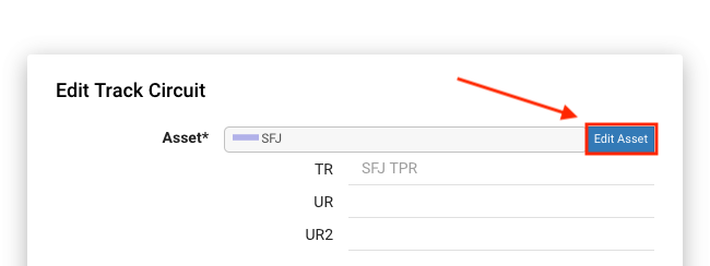
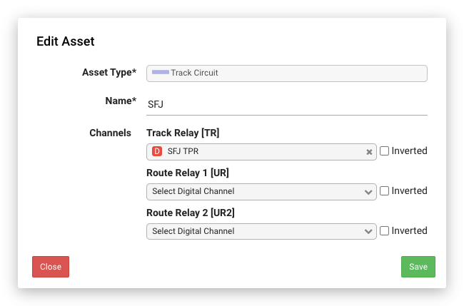
There are two ways to edit an asset in the designer, the first is to use the "Edit Asset" button on the dialog that appears when you double-click an object on the map as demonstrated below:
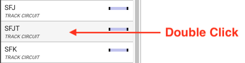
Alternatively you can also double-click on an asset from the "Asset" list in the sidebar:
The asset edit dialog allows you to edit the asset's name and any associated digital channels also mark them as inverted if required. This dialog lacks many of the features of the full asset page (Main Menu > Assets > Asset List) and is provided to allow basic channel changes to be made.
Known Limitations
The new map designer currently has a few limitations which are documented below. These may be resolved in an upcoming release.
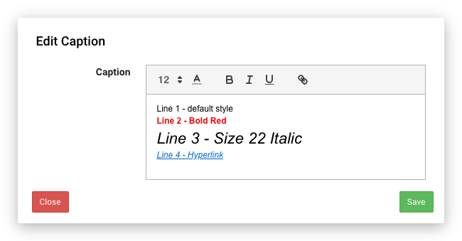
Caption Styles
This is probably one of the biggest differences between the legacy and new designers, caption text is limited to a single style per line of text in the new designer. In the legacy designer it was possible to vary the style for each individual character if desired.
It will appear like this in Playback:
Dragging tracks to rotate
In the legacy designer it was possible to drag tracks to rotate them using the mouse as demonstrated below:
This is not currently supported in the new designer, instead you need to make use of the "rotate clockwise" button (L key) and "rotate anticlockwise" button (R key) to achieve the same behaviour as demonstrated below:
Tablets and touch devices
Whilst the new designer will load on touch devices such as tablets it will not be possible to use most of the functionality. This is something that may be supported in the future by supporting specific touch events and gestures. For the moment we recommend you use a laptop or desktop computer with a mouse.
Terminology
| IBJ | Insulated Block Joint, also known as an Insulated Rail Joint (IRJ). A rail joint in which one rail is electrically insulated from an abutting rail. |
| Overlap | An overlap is a short distance beyond a signal detected clear by a track section. This distance must be clear before the preceding stop signal can exhibit a proceed aspect. The purpose is to provide an additional safety margin in case the driver overshoots the signal. |
Generate Assets
The asset generation function will attempt to create map assets based on the channels that are available for a site. The asset generator will scan through the list of channels and attempt to match specific patterns to populate the fields for the various types of assets. The table below shows the assets generated based on matching different names.
| Asset | Matches |
|---|---|
| Track Circuit | TK, TR, T?PR, TP?R |
| Points | NWK, NWKR, NWKPR, NWK?PR, NKR, NKPR, NK?PR, NKP?R, RWK, RWKR, RWKPR, RWK?PR, RKR, RKPR, RK?PR, RKP?R, AUK, BUK |
| Signal | RGK, RGPR, DGK, DGPR, HGPR, HHGPR, YR, YPR, PLGPR, PLGR |
| Position Light | PLGPR, PLGR |
| Drivers White Light | DWLR |
| Treadle | QRR |
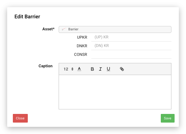
| Road Barrier (LC) | UPKR, DNKR |
| Road Lights (LC) | RECR, HJPR, HER, CONSR |