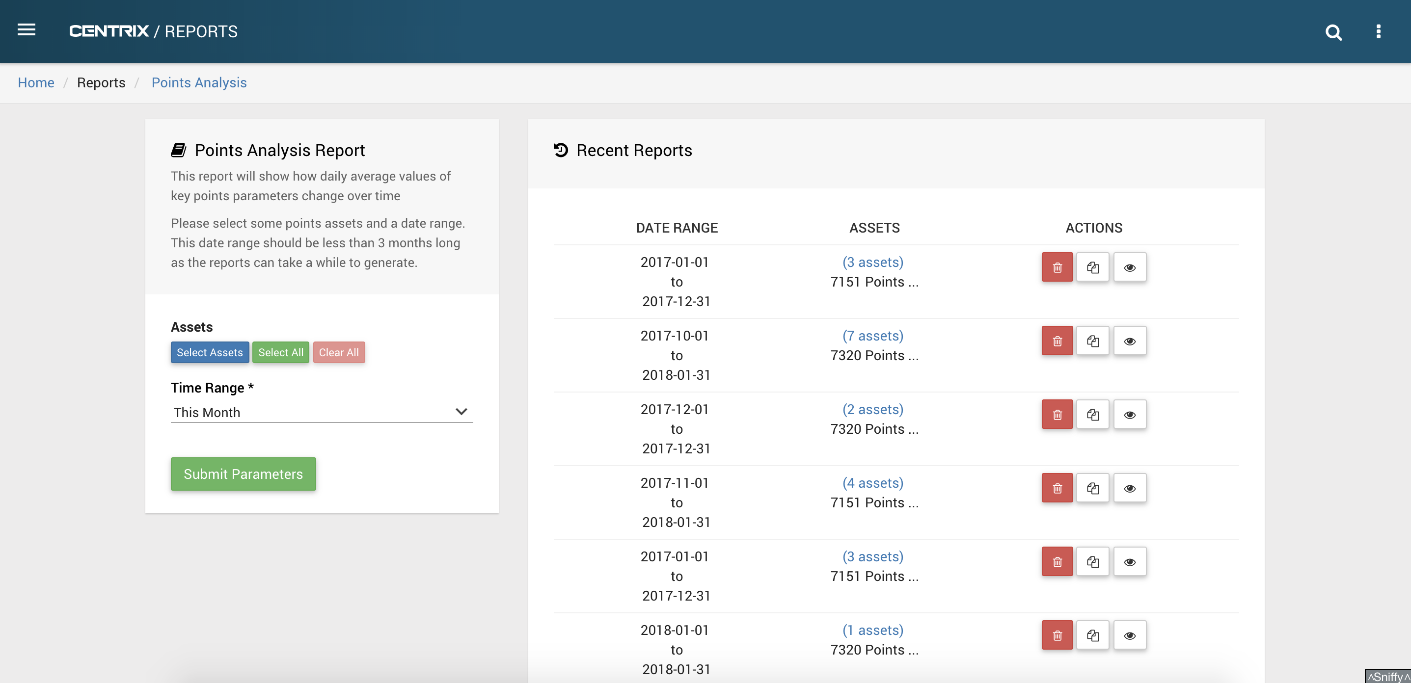
The points analysis report can be used to compare how trace values on different points change over time. By selecting similar points for comparison, any points behaving erroneously should stand out.
Selecting Parameters
Multiple points assets and a time range should be selected before submitting the parameters.
A custom date range can be chosen, or there are shortcut options to specific time ranges. The time range is in full days and can't be more than 3 months long because reports can take a significant amount of time to generate.
Providing data exists for the points assets and time range selected, the parameters will be saved and you will be taken to the specific page for that report.
Once successfully submitted, the parameters will appear on the right side of this page along with other recent reports.
Each recent report has buttons to view the entire asset list, delete a report, copy the report parameters to the current selection and to jump to that reports main page.
Viewing and generating a report
The report will begin to be generated as soon as the parameters are submitted. While it is being generated, no graphs will be visible.
Once generated, the re-generate report button can be pressed at any time to make sure the data is up to date.
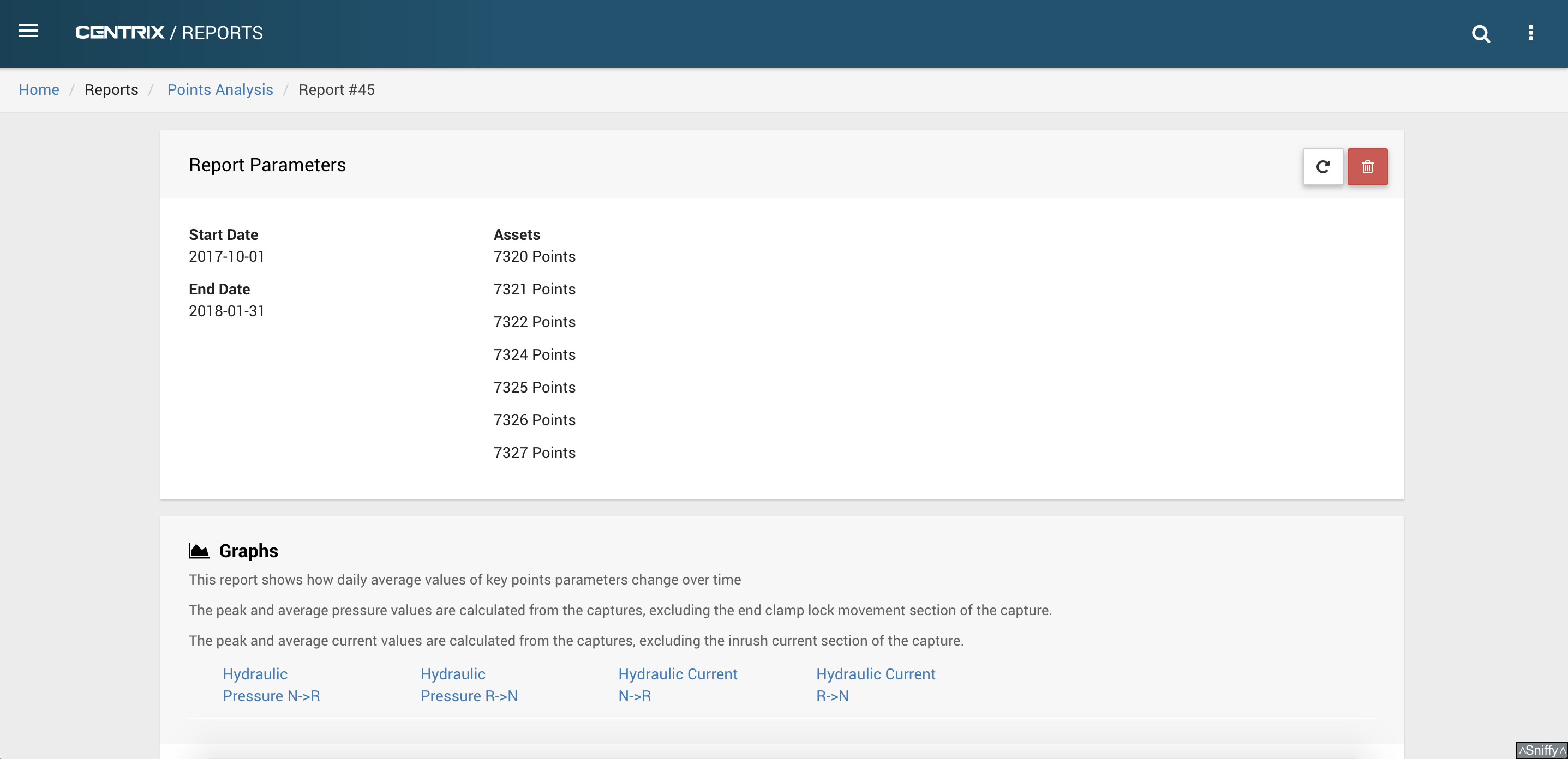
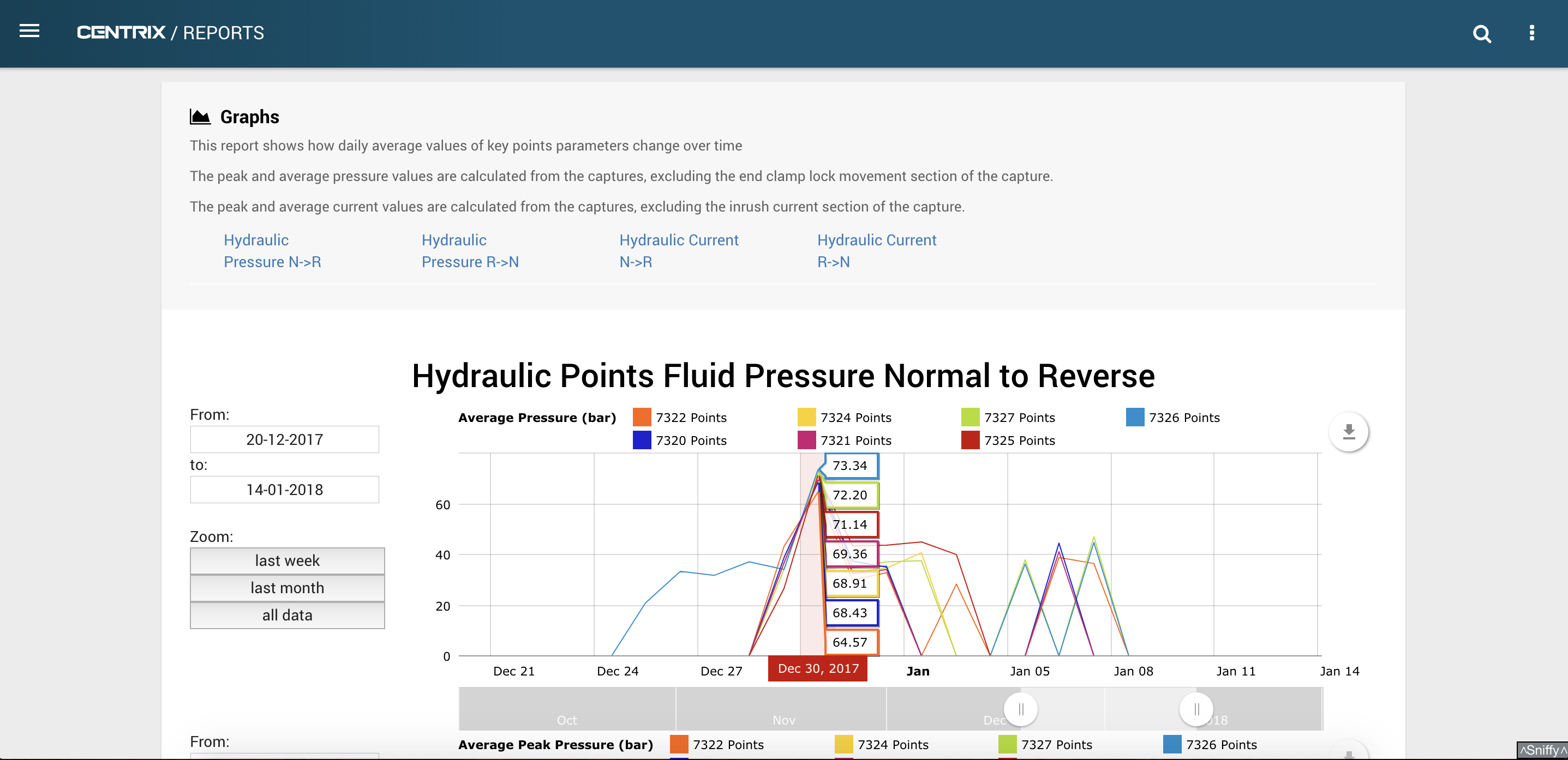
Hydraulic points display graphs for hydraulic pressure and electric motor current, while electric points only display graphs for electric motor current.
For hydraulic pressure, data on swing time, average pressure (excluding clamp lock movement) and peak pressure (excluding clamp lock movement) is shown.
The clamp lock movement region of a typical trace is shown below under the grey region. The red-boxed region is what would be used to calculate the average and peak pressure.

For electric current, data on swing time, average current (excluding the inrush current) and peak current (excluding the inrush current) is shown.
The inrush current region of a typical trace is shown below under the grey region. The red-boxed region is what would be used to calculate the average and peak current.

Every point on a graph is a daily averaged value.
Data from the points moving from the normal position to the reverse position (N → R) are treated separately to the data from the points moving from the reverse position to the normal position (R → N).
Data from each points asset can be toggled between hidden and shown. Any time range can be zoomed to using the slider bar below each graph.