Health Dashboards: View
Overview
Health dashboards provide a facility to show the status of alarms across multiple locations, with user customisable aggregation and grouping.
If every alarm is quiet, then each group containing that alarm will be green. When an alarm is triggered, it will change colour and every group containing that alarm will change colour.
Alarms can be aggregated together into a single group. Multiple groups can then be aggregated together into another group and so on and so on. Any number of 'children groups' are allowed.
The lowest level group, where alarms are aggregated together, is called an indication.
A dashboard contains multiple groups and indications. Some groups can contain more children groups than others.
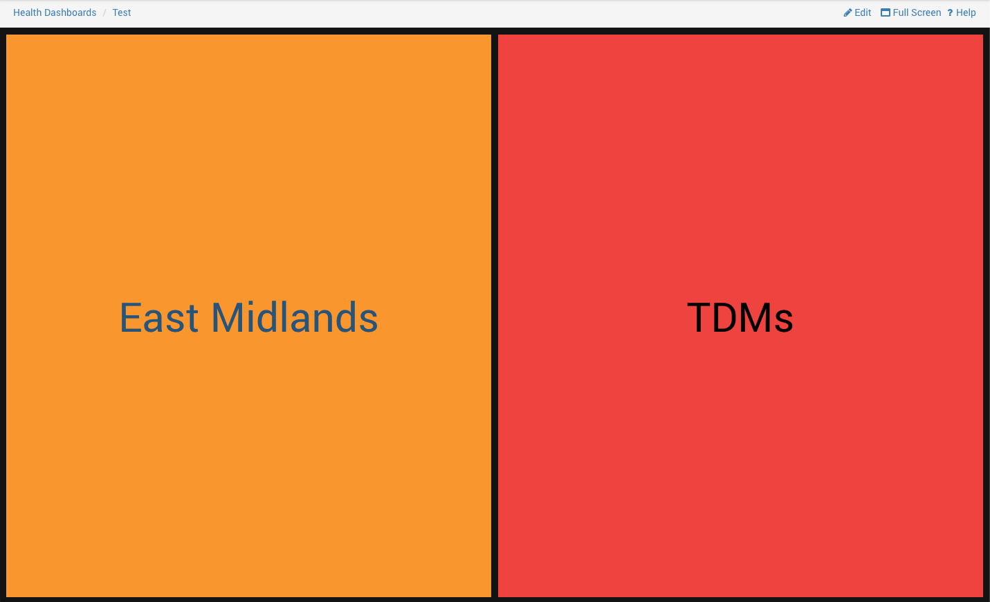
Dashboards have a tree-like structure: The dashboard is the top level node. Groups branch off of this and further groups can branch off of these, until the lowest level indications are reached.
A user can view any group or indication. Each view maximises the space available and has a full screen option to replace the Centrix header with the dashboard title.
When viewing all the alarms in an indication, you can see their current state (defined below) and click on any alarm to go directly to that alarm's page.
Viewing the full Health Dashboard Structure
A user can create a health dashboard to have as many layers as they like. Each layer can contain a mixture of groups and indications.
It is possible for Health Dashboards to get very complicated and hard to picture.
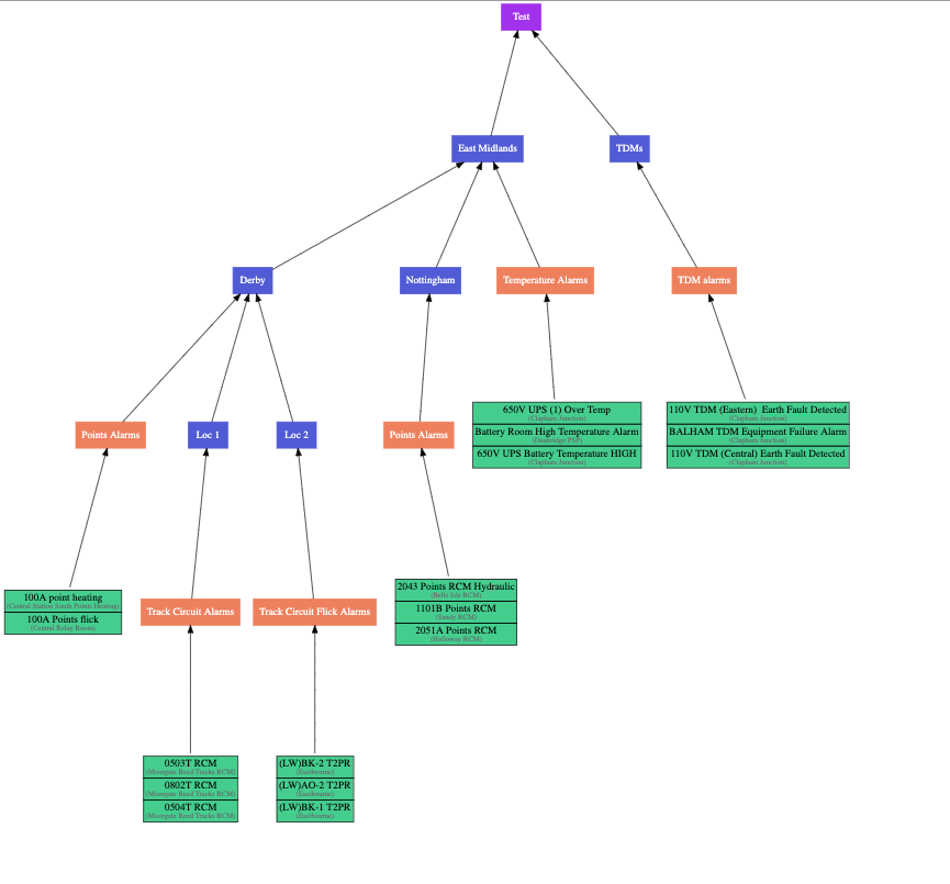
There is a download 'SVG' button which can be used to show you a diagram of the entire structure of a health dashboard.
A dashboard may have a fairly simple, regular, structure like this:
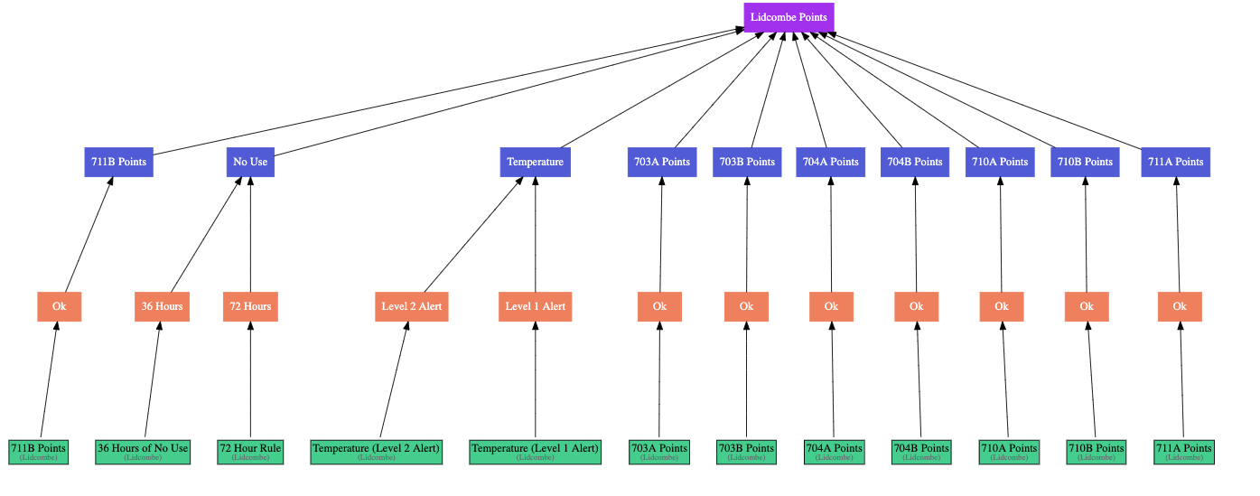
Or a more complex, layered, structure like this:
Viewing a Dashboard
The main health dashboard page is available from the Centrix main menu; Alarms > Health Dashboards.
Here you will see the list of available dashboards.
You can search for a dashboard by name and then select the dashboard you wish to view:

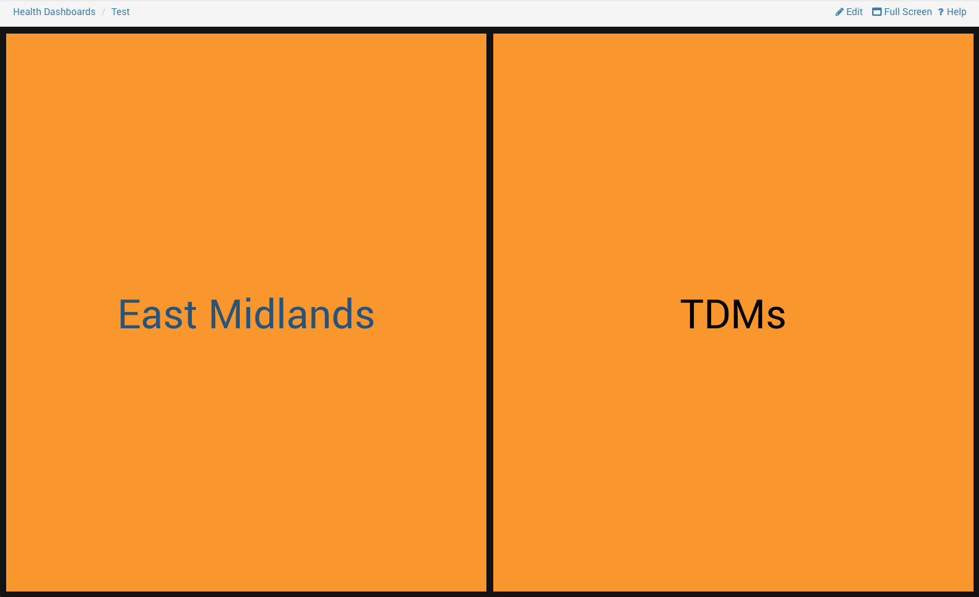
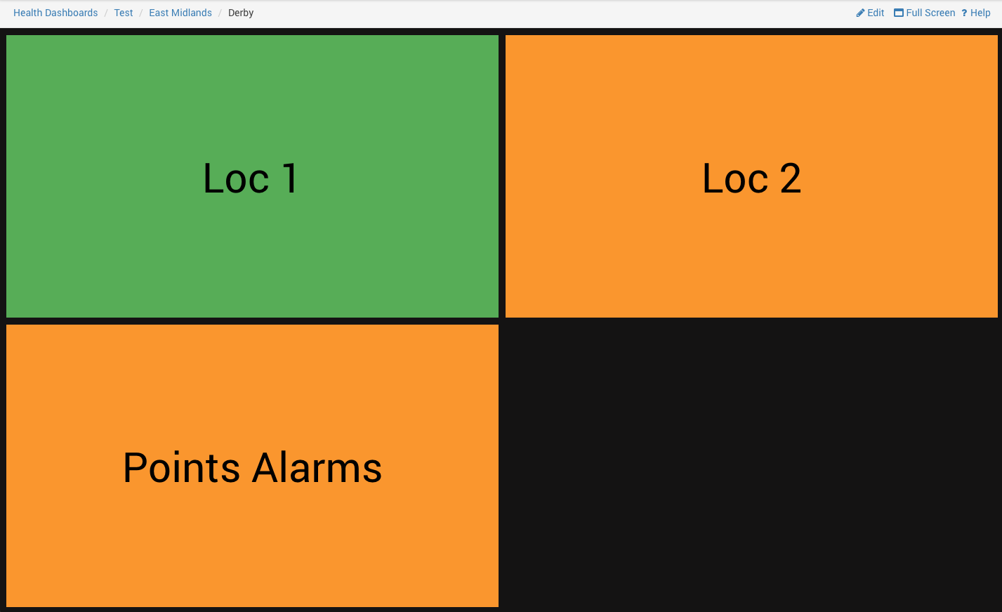
This takes you to the Dashboard's highest level view:
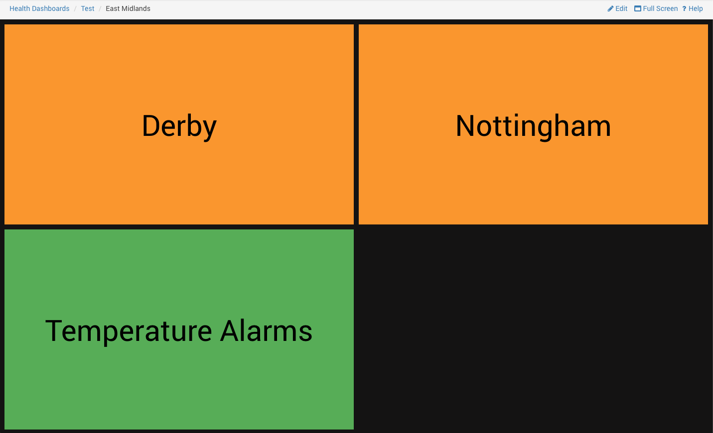
Clicking on one of these boxes drills down into the next layer:
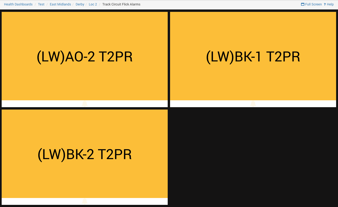
Until eventually you reach a bottom layer which shows multiple alarms:
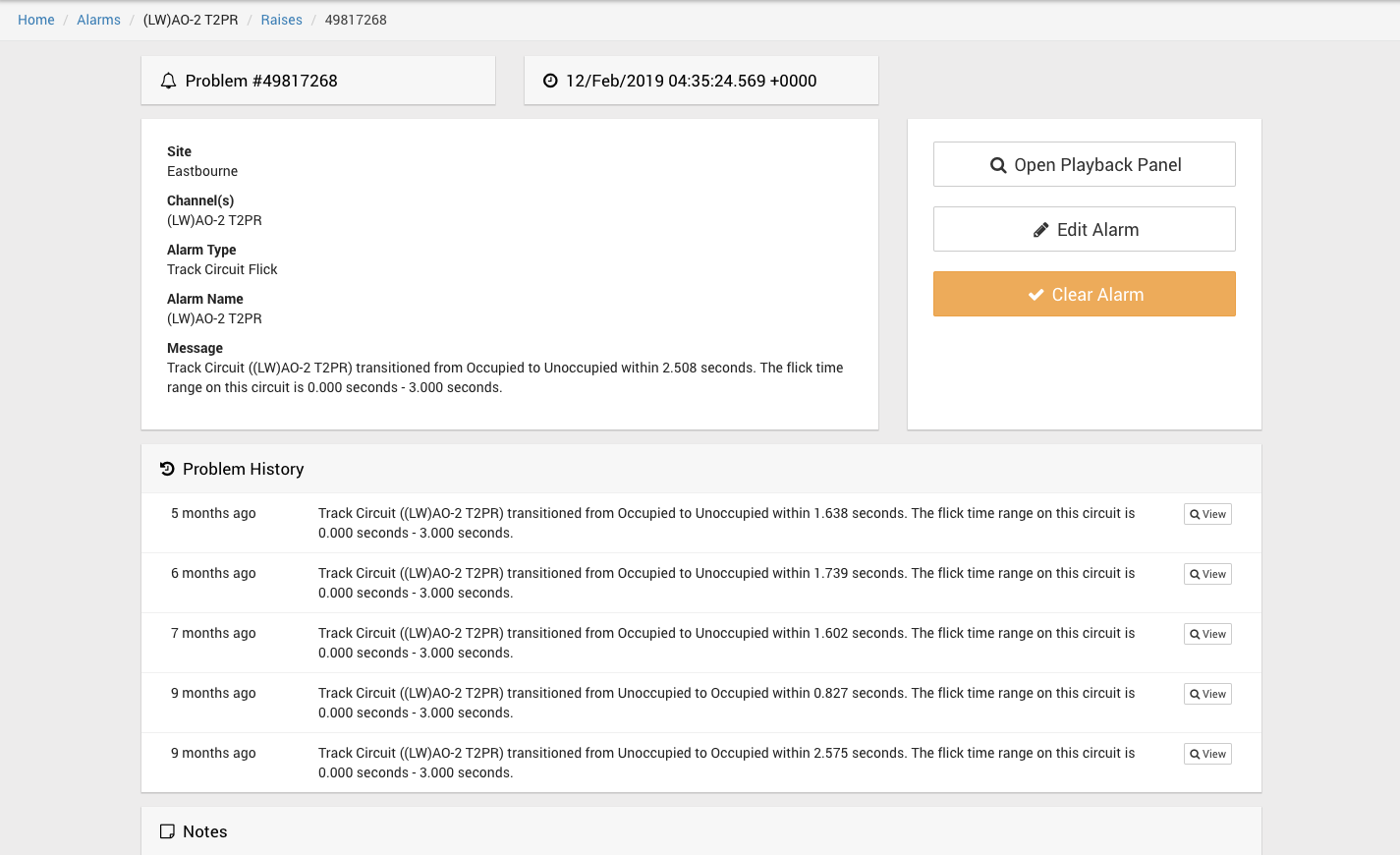
Clicking on one of these alarms, takes you to the specific alarm raise page for that alarm:
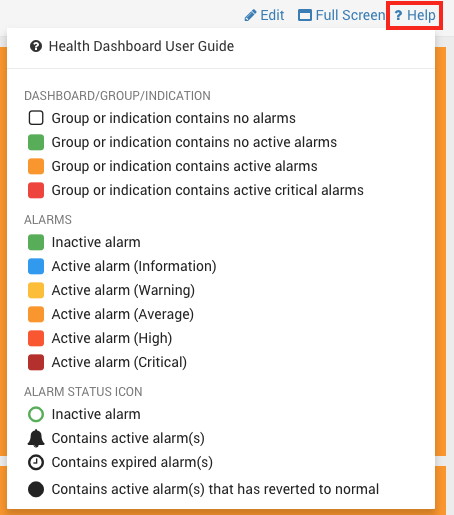
What do all the colours mean?
In any of the views, you can click the 'Help' button to view a helpful dropdown explaining what all of the colours and icons mean.
Note that indications contain alarms and each alarm contains a status icon at the bottom.
Indications and groups do not contain an icon.
Alarms are different colours based on their severity.
Indications and groups are coloured based on whether an alarm they contain is active and whether that active alarm is critical.
They are orange if at least one alarm is active and are red if at least one of the active alarms is critical.
Critical Alarms
In the example of the very top layer. One of the health groups was orange, and another was red.
Both of these (non-green) colours indicate that there is an active alarm somewhere within it's hierarchy.
When creating a health dashboard, a user can mark certain alarms as 'critical'. This is purely a health dashboard option and does not affect anything else. It is different to the usual 'severity' that you can mark alarms with.
A critical alarm will cause groups or indications containing it to be red when the alarm is active. A non-critical / normal alarm will cause groups or indications containing it to be orange when the alarm is active.
If the underlying alarm is changed from critical to non-critical, then the top layer will subsequently appear with both groups as being orange:
Reverted to Normal and Self Clear Alarms
Many alarms have a 'reverted to normal' state, for example when an analogue value drops back below an upper threshold, it has 'reverted to normal'. i.e. it has started behaving normally again.
There is a difference between an alarm reverting to normal and an alarm being cleared by a user.
The creator of a Health Dashboard can decide whether they want an alarm that has reverted to normal to cause groups and indications containing it to be green or not green. i.e. If it has reverted to normal, do you still want users looking at the top level to see that there is a problem. The creator of a Health Dashboard can toggle this by toggling whether the alarms are in 'self clear' mode.
Health groups and indications containing alarms in Self clear mode will automatically become green again the alarm status if the underlying alarm enters a reverted to normal state - this is only available on certain alarm types.
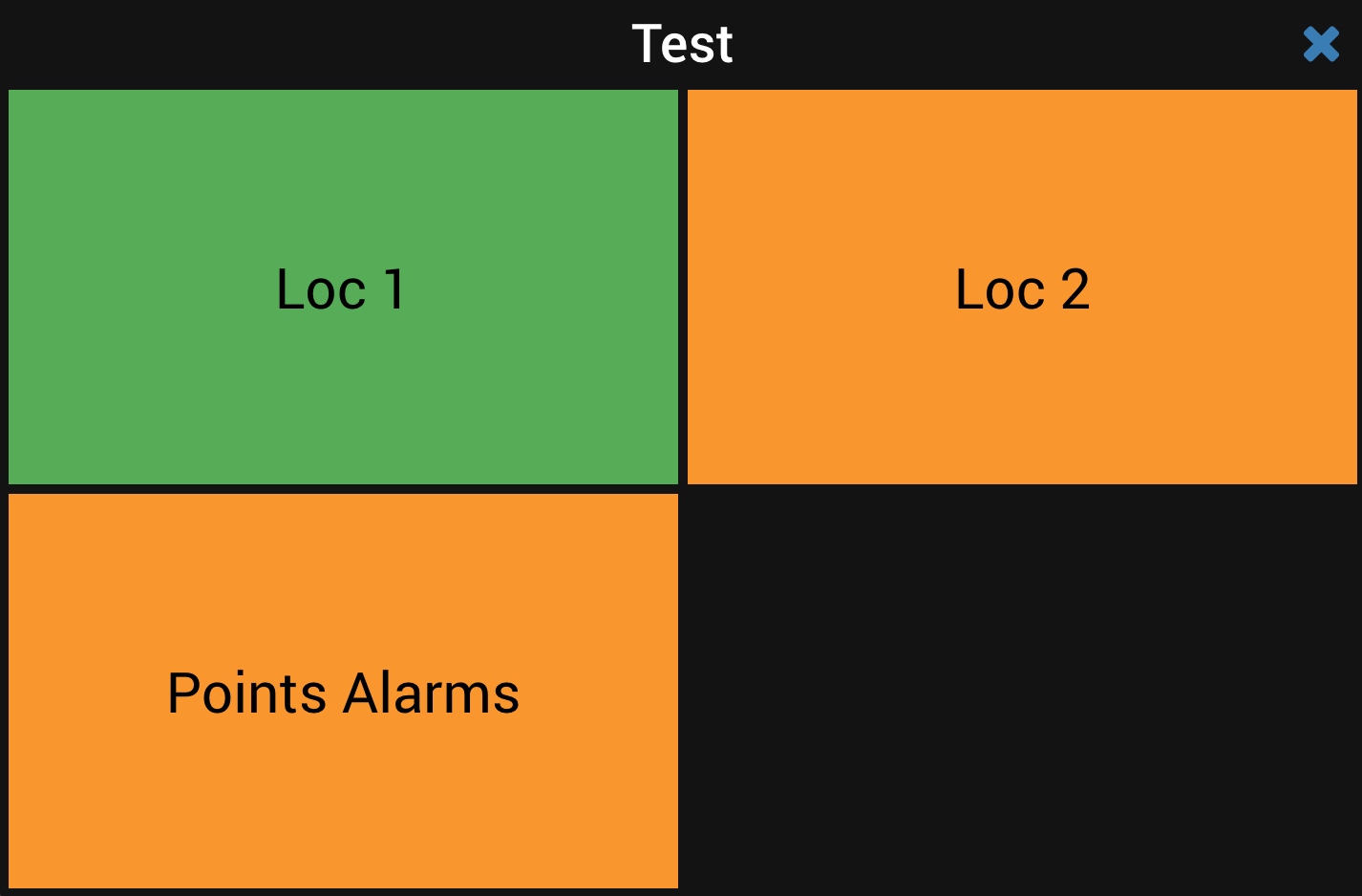
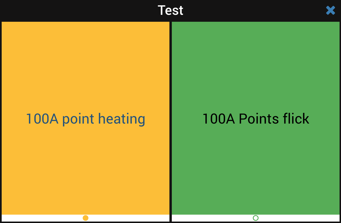
Here are two alarms, one has reverted to normal, one is inactive (never raised or manually cleared by a user):
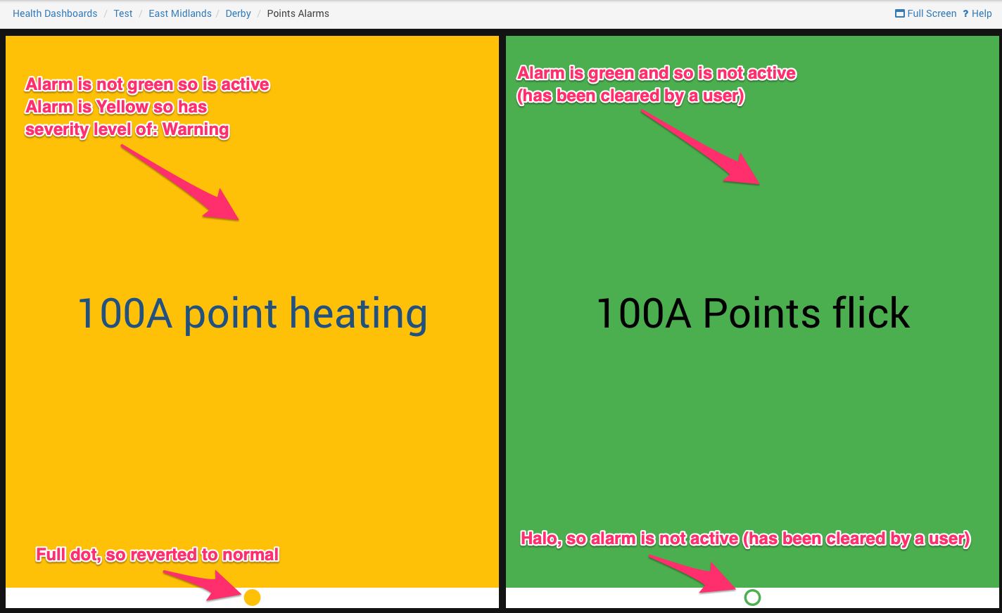
Both of these are in the indication called 'Points Alarms'. Here is what the layer above looks like if 100A point heating has the self clear toggle on:
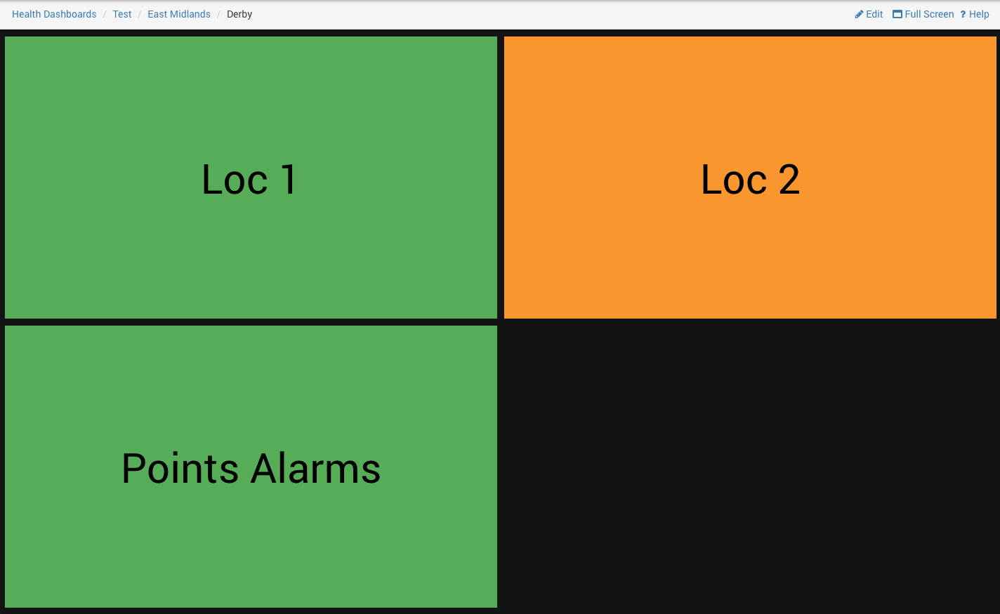
Both of these are in the indication called 'Points Alarms'. Here is what the layer above looks like if 100A point heating has the self clear toggle off:
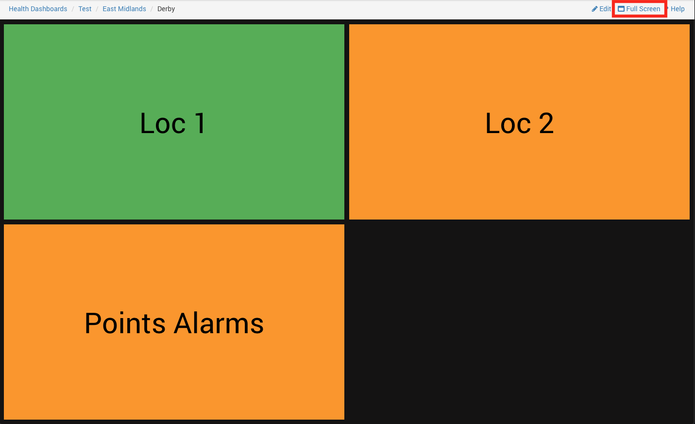
Full Screen Mode
Health Dashboards have a full screen mode. You can click the button in the top right corner to enter it.
And you can then click the cross button in the top right corner to exit it.
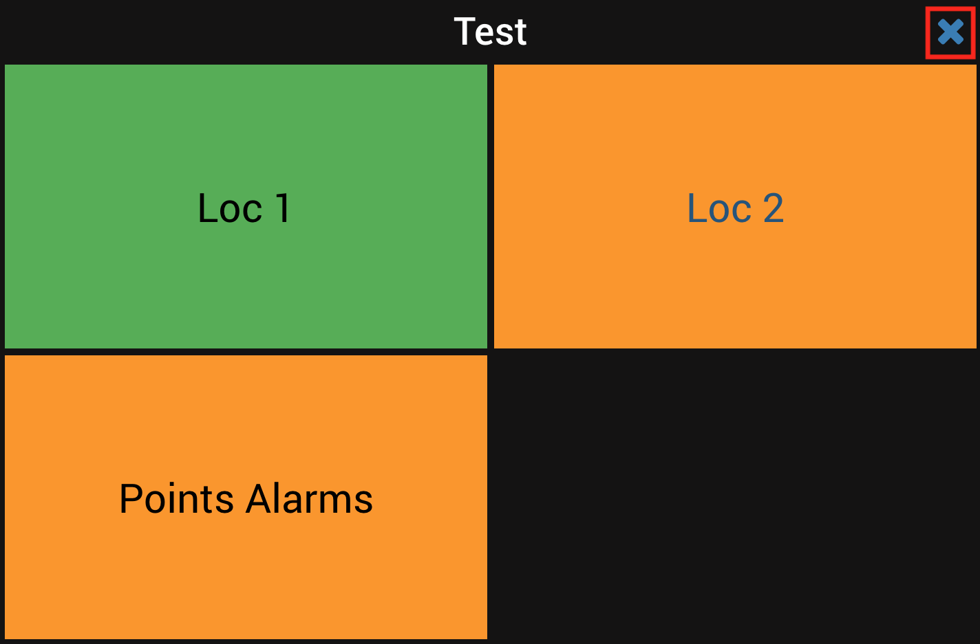
While in full screen mode, you can navigate around by clicking on the boxes and using the browsers back button to navigate to where you were previously